Case study: Coverflex employee self-explanatory product
Coverflex is a compensation management solution that unites all components of compensation beyond salary.
Employees can unlock their full earning potential, personalise their compensation package, making choices on how to spend their value on what suits them best by using their personal VISA card and app

Role
UX Researcher
UX Strategist
Product designer
UI Designer
Scope
UX Research
UI/UI Design
Business analysis
Architecture information
Heuristic evaluation
Tools
Figma
Notion
Google form
Timeline
2 Weeks
The challenge
Coverflex self-explanatory product (employee)
One of the main objectives of the challenge is to inform users where they can find more information about the benefits of Coverflex and other features of the application.
So they can better understand how the benefits system works and make recurrent use of the advantages it offers them.

Research
In this first stage to understand the user, I did 2nd research, online surveys, users interviews, business analysis and interview with Subject Matter Expert.
Survey
The survey showed that 75% search for information via the App and only 25% use the desktop version.
Most difficult benefits to understand
Childcare, retirement and health are the three most difficult benefits for users to understand.
Subject Matter Expert Interview
“Coverflex is the best benefits management tool I have used. All your benefits centrally on one platform”
How would you like to learn about these tax advantages?
They prefer video or something visual, because texts can be difficult to understand.
Business & Competitive Analysis
Coverflex is a flexible benefits platform that offers companies an easy and efficient way to manage employee benefits. To better understand Coverflex’s competitive position in the market, it is necessary to analyse companies offering similar services.


Coverflex competes directly with Cobee and Swile, as all of these companies focus exclusively on flexible benefits. Although Edenred, Sodexo, Aon, Mercer and Willis Towers Watson offer employee benefits solutions, their focus is not specifically on flexible benefits. Ben offers complementary services to those of Coverflex, as it focuses on incentives, discounts and wellness programmes.
Problem statement
What
Design a post on-boarding experience for employees (both desktop and mobile) that effectively informs them about the benefits of Coverflex and at the same time encourages them to start using the application as soon as possible.
Why
It is difficult for users to understand the fiscal specifications of our product and how they can use each category of benefits to get the most out of Coverflex.
Objectives
To encourage recurrent use of the app.
Many user find difficult to understand the tax specifications and use Coverflex´s features effectively
How might we?
How might we be attractive but provide all the necessary information?
How might we explain tax efficiency in a simple way?
How might we include this information in the product without interrupting the main actions and flows?
Heuristic evaluation
Based on my observations, it seems that there are several areas where the Coverflex website and app could be improved in terms of usability and user experience.

The lack of contrast between the text and background can make it difficult for users to read and understand the content.
Gradients can make it hard to distinguish text from the background, especially when the contrast is already low.
Text that is too small can be hard to read, especially for users with visual impairments or older users.
A fixed header can be useful on mobile devices, but it should provide more information than just the logo.
If the icons in the main menu are not clear and identifiable, users may have difficulty navigating the app.
The info button should provide more information than just an “i” symbol to help users understand what it does.
If the contrast between text and buttons is not strong enough, users may have difficulty identifying the buttons and understanding their purpose.
Without a help area, users may have difficulty finding information or getting assistance when they need it.

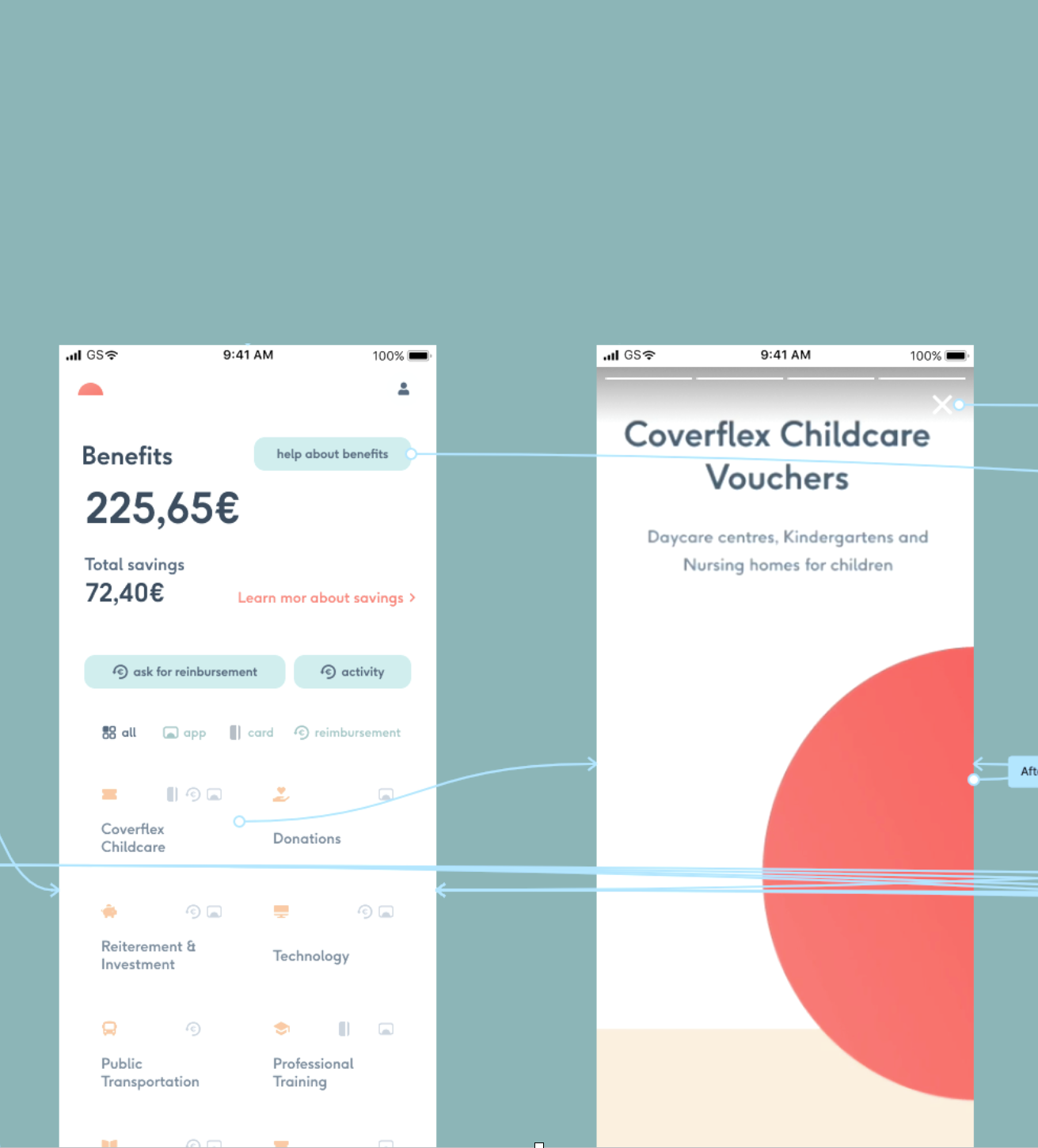
The solution
Be informative and attractive. The task was to inform the user about the benefits, taxes and other functionalities of the application in an attractive way and without interrupting the user’s flow.
After a Desirability Testing the decision was the cleanest one as it kept the content structure but I made some changes based on the result of the heuristic evaluation and this was the result.
Based on the research phase people understood the information better through videos, animations and icons one of the most widespread solutions to do this is stories like instagram or Facebook.
I also include a help center section where you can expand all the information in more detail.


Prototype
I had to make a prototype for the mobile and desktop versions. I started with a low-fidelity prototype and usability text, most of the users found it difficult to identify the actions of the buttons.
Then I moved on to a mid-fidelity prototype, the problem persisted and then there was another problem, the benefit explanatory texts were confusing.
In the hi-fidelity prototype I solved this problem and tried to show the self-explanatory part of the product in a different way but keeping the coherence for the mobile and desktop version.

HI-FI Prototype mobile version
The flow I am going to show you is how to create a childcare voucher for a school:
On the home page we select the benefits option > then we select coverflex child care > we see the first self explanatory product feature with the stop option in the middle of the screen >on the create voucher screen we have a link to help center where you can find information about any benefit > we start to create the voucher > we enter the amount and the school and finally we confirm >we create it and confirm it >the system generate a issue> and we can check the information about the voucher.
HI-FI Prototype desktop version
And finally I am going to show you the desktop version. In this case I will only show the self-explanatory features, the home page and the help centre.