Case study: Redesigning Fintonic
For this challenge, I have chosen Fintonic, a mobile application and web platform that offers personalized financial management services to its users.
The application allows users to efficiently and simply manage their bank accounts, credit cards, and expenses, providing an overview of their finances in real-time.

Initial Evaluation
Heuristic Evaluation
In an initial evaluation of the application design, I found issues with the consistency of icons, colors, and design throughout the application. There is also a lack of visual elements to help users recognize different sections and categories in terms of text hierarchy.
Using the 10 points for heuristic evaluation of an application, I obtained some results that could improve the user experience of an application.
As for the system status visibility, there are some problems with loading and lack of fluidity in different input modes.
The adequacy between the system and the real world is affected by unclear and confusing icons in some parts of the application. There are inconsistencies and a lack of standards in the icons and colors used in the navigation bar and in the different sections within the application.

My Suggestions
My suggestion is to personalize the home page and use corporate and complementary colors to improve the effectiveness and flexibility of use, as well as better content organization and some bold text to improve content hierarchy. It would also be good to have a dark mode version for more experienced users and help and documentation to recover from errors.
Another suggestion regarding the home page is that users can more easily access the sections they use most frequently, meaning that the user can configure what content or statistics they want to see on the first screen. As for aesthetics, the incorporation of corporate and complementary colors would improve the overall aesthetics and usability, and finally, better organization of content with the inclusion of bold text to improve information hierarchy.
Overall, the application could benefit from improved documentation and help to improve the user experience and help users solve problems and get the information they need more efficiently.
Competitive Brand Analysis
Business competitive analysis
I have conducted a competitive analysis of the brands MoneyPlan, MoneyWiz, and Spendee Budget & Money Tracker:
MoneyPlan offers financial planning tools such as retirement and investment planning, as well as budget tracking and expense categorization. It has a clean and intuitive interface that is easy to navigate.
On the other hand, the application can be overwhelming for some users with its extensive financial planning tools.
MoneyWiz offers account integration for automatic transaction input, as well as manual transaction input. It has a solid set of features such as budget tracking, expense categorization, investment tracking, and financial forecasting. Available on multiple platforms, including desktop and mobile.
Some users may find the interface cluttered and confusing. There is no free version available, with a relatively expensive subscription price.
Spendee Budget & Money Tracker:
It has a clean and visually attractive interface focused on expense tracking and budgeting. It allows for manual transaction input and integration with bank accounts. Offers personalized budgets based on spending habits.
It lacks some of the more advanced financial planning tools offered by MoneyPlan and MoneyWiz. Limited investment tracking capabilities. Some users have reported app errors and crashes.


Mood board

Color, typography, and style effects
In creating the Fintonic style guide, the idea was clear. I needed a range of complementary colorsIn the creation of the Fintonic style guide, the idea was clear. I needed a range of complementary colors to distinguish the different categories and display statistical data on income, expenses, transfers, etc…
I also wanted to show the different cards, accounts, and products in a more visual and realistic way, which is why I studied displaying them as a card holder. As for the backgrounds, I wanted it to be a clean and orderly interface using only light colors.
The use of the corporate color was one of the main premises, integrating it into buttons, menus, and cards as well as other elements of the application.
Regarding text hierarchy, I used the same RedhatDisplay font, but discarded the regular version because it was difficult to read. I replaced it in the body, buttons, and links with the medium version, implementing different font sizes and using the semi-bold and bold versions to create a clear hierarchy pattern in the headers.

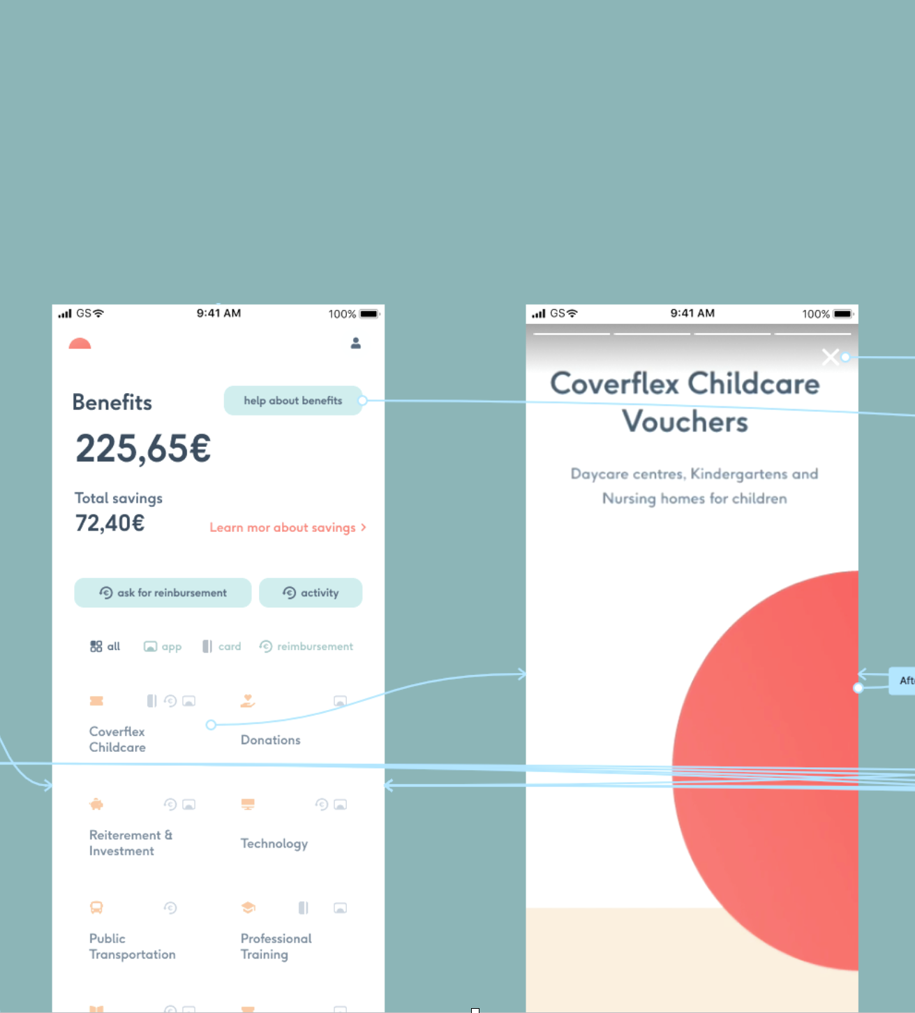
HI-FI Wireframe
To create my wireframe, I chose a user flow from logging into the application > authentication > home page > analyzing one of the expense categories > transfer screen > transfer detail.
This is the result of all the work explained above and how heuristic evaluation can help you solve usability problems and transform a somewhat disorganized application into a clean and usable one.

HI-FI Prototype
Here is the Hi-Fi prototype of my Fintonic redesign, I hope you like it.
This exercise has taught me the importance of the different elements included in heuristics and how conducting a rigorous evaluation can transform the application into a better version, more usable, more intuitive, and more attractive.
Thank you very much to those of you who have made it this far, I would appreciate it if you left a comment, until next time.